Hydroponic Farm Admin Dashboard Redesign
Overview
A leading hydroponics company needed a complete overhaul of their admin dashboard. The existing system, while functional, struggled with a cluttered interface, a confusing information hierarchy, and numerous unused pages and modules. This led to user frustration and hindered productivity across all departments.
I played a key role in the UX/UI redesign, focusing on streamlining workflows, improving usability, and building a scalable foundation for future growth.
Role
- UX Design
- Visual Design
- UX Writing
- Workshop facilitator
- Prototyping
- Testing
- Frontend assistant
- Animator
- Documentation
Date
2022 - 2024

Navigating a Complex System
Our initial focus was on understanding the existing platform and its user base. Through workshops and user interviews, we discovered significant challenges for various user roles. The sheer volume of data was overwhelming, presented in a dense layer of technical jargon that made it difficult for non-technical users to understand. For me personally, traversing this complex terminology was a challenge, but it also helped solidify the depth and scale of the project. This understanding became crucial in designing a solution that catered to diverse user needs.

User-Centered Solutions
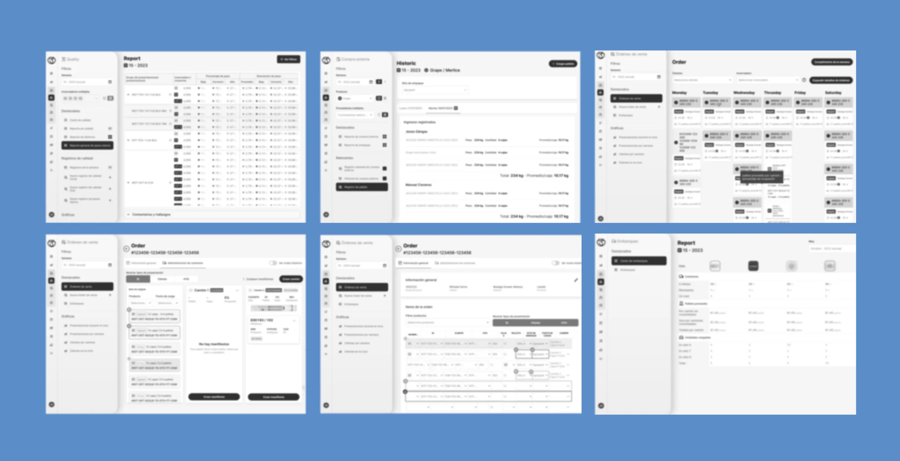
To address these challenges, we implemented a multi-faceted approach. Data prioritization based on user roles ensured each department could easily find and interpret the most critical information for their work. While we couldn't completely eliminate technical jargon, we strived to present it in a way that was clear and understandable to a broader user base. Development efforts were prioritized on high-impact features, including a robust shipment tracking system and performance dashboards. These empowered users to streamline workflows and make data-driven decisions.


Building for the Future
The redesigned platform wasn't just about aesthetics; it was about building a solid foundation for future growth. We established a comprehensive design system with reusable UI components and consistent interaction patterns. This ensured a cohesive user experience across the entire platform. Responsive design principles were also incorporated, guaranteeing optimal usability on desktops and tablets, catering to diverse work environments. Throughout the process, close collaboration with developers was maintained, ensuring technical feasibility and a seamless transition from design to implementation.
Lessons Learned
While the redesigned platform delivered significant improvements, there were areas where the process could have been further optimized. Open and continuous communication across all teams would have streamlined collaboration and ensured everyone was aligned on goals. Additionally, a focus on setting realistic design goals at the outset, along with readily available code documentation, would have facilitated a smoother development process. Ultimately, this project solidified the importance of listening to user feedback at every stage of the design process. Understanding user pain points should be the driving force behind all design decisions, not simply making things look aesthetically pleasing.

This project showcased my ability to navigate complex systems, translate user needs into actionable design solutions, and collaborate effectively within a cross-functional team. It also highlighted my understanding of the importance of continuous learning and improvement in the design process.